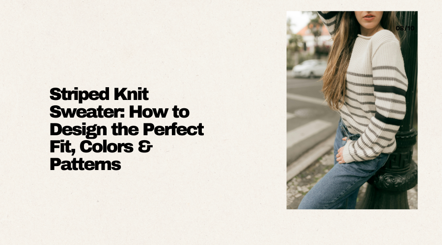
You have a striped knit sweater in your head. It looks effortless: crisp lines, flattering fit, colors that feel “you,” and stripes that are have visual appeal and dont feel too overwhelming. Then you start knitting and run into all sorts of problems related to sewing and bringing the design into physical form.
This blog is for that exact moment. You will learn how to choose a silhouette that suits your wardrobe, knit a reliable fit from gauge, pick colors that read well in knitted stripes, and build stripe patterns that look intentional. We have also covered what typically goes wrong and how to fix it before you waste valuable time and effort fixing it.
Begin by choosing a silhouette. You have several options to choose from: classic crewneck, boat neck, cropped boxy, relaxed drop-shoulder, or shaped set-in sleeve. Stripes seem different on each.
A drop-shoulder sweater can have bold, wide stripes and also have loads of visual appeal. A fitted set-in sleeve silhouette often looks best with a narrower stripe width or lower contrast.
Then take measurements you can trust: bust/chest, upper bust (optional but helpful), cross-back width, bicep, and desired length. If you have a sweater you love, measure it too.
Do not design from body measurements alone. A favorite sweater you already own is a better standard for measurements.
Pick one main measurement. For most sweaters, it is bust/chest circumference plus your preferred ease/fitting.
Decide stripe placement at the torso early. If you want a dark color at hem then plan it now.
Flexible tape measure, a sweater you already own for comparison
Determine the gauge, fabric, and ease
Striped sweaters add a twist: two colors may knit up at slightly different gauges, and color changes can alter tension. So swatching needs to reflect reality. Knit a hefty sample in the stitch pattern you will use, and include stripes exactly as planned: at least 3–4 stripe transitions.
• Positive ease/fitting: (2–6 inches / 5–15 cm) if your preference is comfort and layering
• Minimal ease/fitting: (0–2 inches / 0–5 cm) for a tidy, fitted look
• Negative ease/fitting: for stretchy ribbed garments (rare for classic striped pullovers)
Also consider fabric behavior. A yarn with strong drape will make stripes flow softly. A woolen-spun yarn can look graphic and crisp, but also have a bulky feel. Your “perfect stripe” depends on the fabric type and appearance.

Do not trust an unblocked gauge for sweaters.
If one color is notably different in fiber or ply, expect tension shifts.
Swatch in the round if the sweater is in the round. Flat stockinette gauge often differs from round gauge.
Record row gauge, not just stitch gauge. Stripe placement depends on rows.
Stripes should be placed according to a proper plan. If your stripe repeat is 12 rows, make sure other lengths (to underarm, to hem) align with the stripe rhythm.
Blocking supplies, ruler or gauge tool, spreadsheet (optional), kitchen scale for yarn management.
Choose colors and Design: contrast, undertones, and harmony
Color choice is where many striped sweaters look either amazing or terrible.
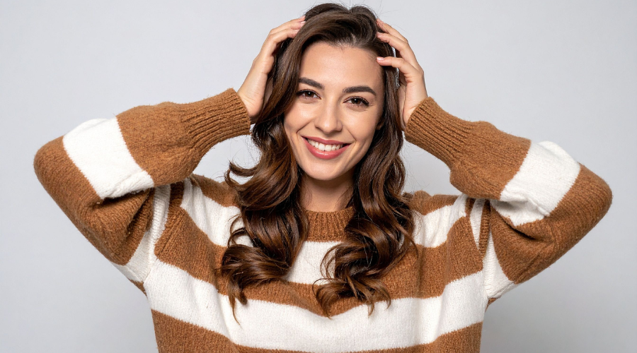
The design tip that makes a sweater look amazing is contrast. High contrast (navy/white, black/cream) has a bold and graphic vibe. Mid contrast seems sophisticated and softer. Low contrast has a subtle look, but can blur into “texture” rather than “stripe,” which may be exactly what you want.
Next, check color tones to see if they have proper contrast. Two blues do not create enough contrast, especially if one has a greenish shade and the other has a violet shade. An easy test is the black-and-white photo trick: take a photo of the yarns together and apply a grayscale filter. If the values (lightness/darkness) are close, the stripes will be low contrast.
Finally, consider the placement of colored stripes. Dark near the hem and cuffs is great for a sophisticated look. Adding a lighter stripe band near the face can brighten your complexion.
Store lighting lies. Check yarns in daylight and indoor light.
Some yarns “bloom” after blocking and soften contrast.
Choose one neutral color. Then add one color with personality. This keeps the sweater design versatile enough to wear with any kind of bottom.
Limit yourself to two colors for your first custom stripe design. Three can be beautiful, but it makes execution difficult.
Test a micro-swatch with both colors.
Phone camera (grayscale check), color wheel (optional), mini-swatch needles.
Stripe patterns design tips and planning
Random stripes often feel “off” because there is no pattern for the brain to latch onto.
Pick a stripe design strategy:
Classic equal stripes (e.g., 6 rows A, 6 rows B)for a timeless and traditional graphic.
Wide-and-narrow rhythm (e.g., 10A, 2B, 10A, 2B) for a refined, minimalistic appeal.
Slope in width (stripes get narrower toward yoke or cuffs) which creates shape and movement.
Placement bands (solid yoke + striped body, or striped yoke + solid body). This is the formula that makes the design catchy.
Now, place stripes where they have visual appeal. If you want the torso to feel longer, keep stripes narrower and lower contrast, or include vertical breaks. Conversely, if you want shoulders to look structured, consider solid shoulders with stripes starting below.
The sleeve design should also align. Matching stripes at body and sleeves is satisfying, but such perfection can be skipped. What matters more is that sleeve stripes look consistent within the sleeve and have a uniform width.
Stripe jogs happen in the round. Learn or choose a jogless join method to avoid this complication.
Design from row gauge. That involves deciding stripe heights in rows, not inches.
A solid band at hem, yoke, or cuffs is a great design strategy for maximum visual appeal.
Stitch markers (for stripe changes), jogless stripe video tutorial.
Plan the neckline, sleeves, and durability
Choose a sweater construction method that fits your wearing convenience: top-down raglan for easy try-ons. Circular yoke is easy for aesthetic appeal that involves narrow, seamless stripes around the body, or bottom-up for classic structure.
Neckline matters because it sits near the face. A crewneck sweater with a few rows of the darker color can frame nicely. A lighter stripe at the collar can brighten, but it may also highlight the neckline area. Your decision should be clear.
Sleeves deserve their own plan. Your best approach as a knitter is to keep stripe repeats aligned to your row gauge and decide whether cuffs are solid or striped. For finishing, weave ends as you go if possible.
Finally, the knitted sweater should be durable and wear-resistant. To implement this you should choose seams or reinforcement at crucial locations, like at underarms. Stripes look best when the fabric does not fold too much and that happens if seams are placed incorrectly.
Abrupt stripe changes at the underarm can look messy without planning.
Try the sweater early and often to check the fitting. Stripes help you see fit issues quickly, so that make spotting faults easier.
Reinforce areas where stresses and wear happen. Utilize a stronger yarn, at underarms, neck, and cuffs.
Waste yarn for try-ons, tapestry needle, blocking tools, schematic template.
Designing a striped knit sweater is just like a small personal project. You start with fit goals and real measurements. And base your decisions on fitting and fabric behavior. Color choice should be done intelligently based on contrast and undertone, and not wishful thinking. You plan stripe rhythm so the aesthetic appeal is perfect. And finally you execute with construction details that protect wearability. When you do this well, the finished piece will match your vision perfectly.
Why do my stripes look uneven even when I knit evenly?
Stripes can expose tiny tension shifts at every color change. Many knitters unintentionally pull tighter (or looser) when switching yarns, creating faint ridges or “wavy” lines. The fix is practical: keep yarn tension consistent. Snug the first stitch after the swap without yanking, and avoid changing needle grip at stripe rows.
How much yarn do I need for a two-color striped sweater?
Most two-color striped pullovers use more of the dominant color, but the split depends on stripe plan and any solid bands at hem, cuffs, or yoke. As a starting point, assume roughly 55–70% for the main color and 30–45% for the contrast color. The more wide stripes and solid sections you place in one color, the more that color dominates.
Are cardigans still in style in 2026? Is a cardi
READ FULLYou have a striped knit sweater in your head. It l
READ FULLWearing sweaters is not just about keeping the body warm, but to look beautiful. Everyone likes t
READ FULL